Stephan von Wiese
The Lagoon in Sfumato
Following a visit to Max Peiffer Watenphul in Venice, Ernst Gosebruch wrote on June 5, 1952, “More than your Venetian architectures under their melancholy veils, what have stayed with me are your still-lifes with the wholly unbound colors.” The correspondence card from Ernst Gosebruch to Max Peiffer Watenphul is to be found in the artist’s papers. Here, the former Essen museum director took note of a succinct turning point in the development of the artist’s work. The fireworks of colors in Peiffer Watenphul’s still-life paintings yielded to a new type of painting in the early nineteen-fifties that omitted powerful accents and contrasts of color, while the colors of the light dissolved and outshone the contours of the objects in ever more sfumato -like fashion. The twelve Venice paintings at the exhibition here in Weimar give a good sense of this development.
Peiffer Watenphul lived in the lagoon city for twelve years, from the autumn of 1946 to the autumn of 1958. He created around 150 paintings with views of Venice during that time. Over these years, Venice became, after some delay at first, a central theme, though its topographical face was not at the fore. Peiffer Watenphul painted against “postcard views,” not by hunting down little-known romantic corners, but through his unusual painting process. Peiffer Watenphul found his own way, even though, after Canaletto, William Turner, Claude Monet, and Filippo De Pisis, Venice seemed largely artistically spent as a theme. The conventional subject matter of the palazzi , the canals, the gondolas, and the sails ignited a process of spiritualization. Painting Venice became a contemplative painting ritual with countless variations in which the point of departure and the face of the city that was the painting’s pretext diminished in meaning amidst the heightened colors of the light. Gosebruch misunderstood these city paintings as surfaces for the projection of moods—but that is not what they are. Painting attains, instead, a higher level of abstraction, and as a painted motif, the painterly means increasingly overrides the outer subject. The painting of the city in the fog is not “melancholy.” Rather, the color extinguishes, causes the city to sink or darken, glitter and light up.
Peiffer Watenphul did not seek out Venice as a theme, as did William Turner, for example, in his three chosen residencies in the lagoon city. External circumstances of fate and personal configurations sent Peiffer Watenphul to Venice as a place of refuge. More or less expelled from Austria, he went to Venice in 1946 because his sister Grace had married the Italian architect Enrico Pasqualucci, and she could offer him space to live and work in her spacious apartment near the Ca’ d’Oro. On a cold autumn night, Peiffer Watenphul fled over the Alps without papers, and was then able to reside in “a pretty room on a small side canal.” Letter to Maria Cyrenius dated October 19, 1946, quoted in Max Peiffer Watenphul, Werkverzeichnis,vol. 1, Paintings and Watercolors, Grace Watenphul Pasqualucci and Alessandra Pasqualucci, eds. (Cologne, 1989), p. 46.
The city was foreign to the painter at first, such that, initially, he continued to work on his familiar Ischia paintings from memory. “I do not yet trust myself to take on Venice itself,” he remarked in November 1946. Letter to Maria Cyrenius dated November 30, 1946, quoted in Werkverzeichnis(see note 2), p. 46. To his former Bauhaus instructor Johannes Itten, he wrote: “Here in Venice, in the winter, the cold and the damp, life is miserable. I can hardly paint” (January 1947). Letter to Johannes Itten dated January 27, 1947, quoted in Werkverzeichnis(see note 2), p. 47.
In the spring, the spell seemed broken. In May of 1947, he wrote, “For weeks I have been painting pictures of Venice that are now beginning to get very good. But first, I had to work my way up to it. Earlier I painted landscapes, now architecture, water, people.” Letter to Maria Cyrenius dated May 15, 1947, quoted in Werkverzeichnis(see note 2), p. 48. In November 1947, the process of painterly appropriation of the new theme still seemed exceptionally wearisome: “I exert myself in every brushstroke to paint it as well as I can, and as laden with sensitivity as I can. If I see that a stroke is not those things, I scratch it off. This is how I work through my paintings centimeter by centimeter, and no empty areas are permitted. The extent to which I am tormenting myself here with my new paintings in Venice I cannot begin to tell you. I am really working obsessively.” Letter to Wolfgang Bingel dated November 11, 1947, quoted in Max Peiffer Watenphul, Werkverzeichnis,vol. 2, Zeichnungen, Emailarbeiten, Textilien, Druckgraphik, Photographie, Grace Watenphul Pasqualucci and Alessandra Pasqualucci, eds. (Cologne, 1993), p. 34.
Bayerische Staatsgemäldesammlungen, Munich
© Blauel/Gnamm — ARTOTHEK
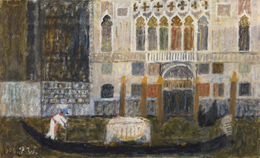
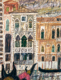
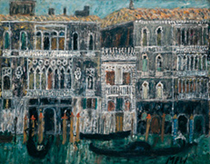
At the XXV Venice Biennale, the German Pavilion curator Eberhard Hanfstaengl selected Peiffer Watenphul alongside Max Beckmann, Karl Hofer, Georg Meistermann, Ernst Wilhelm Nay, Emil Nolde, Karl Schmidt-Rottluff, Fritz Winter, and others as representatives of contemporary West German art. The painting of Peiffer Watenphul’s painting Venice , selected for the exhibition in addition to other works of his, had been purchased in the same year by Hanfstaengl for the Bavarian State Painting Collections. It provides a particularly clear presentation of the early phase of the artist’s visual appropriation of Venice. It will be discussed first in the brief descriptions of works that follow.
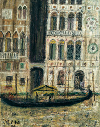
The painting, constructed in clear rectangular planes—in the foreground the gondola, in the background the palazzo architecture with the Gothic six-arch loggia and tracery arcades—does quote snippets of the Venetian atmosphere, but is hardly a minutely accurate veduta (view). The abstract framing of the pictorial composition—as though seen with the photographer’s eye—is enough alone to unsettle the topographic situation. Only with some effort can it be established that this is a view of the Palazzo Corner-Contarini, built around 1450 and located directly adjacent to where the Rio di Luca opens into the Canal Grande. The colors of the painting are largely reduced to shades of ocher and brown, black and white, which substantiate the painterly treatment of details, such as the summary ocher strokes for the motif of the five docking posts. The architectural backdrop has the effect of a painted curtain, with the gondola figure, which brackets the painting, gliding by on a black proscenium, that seems to bear a mysterious cargo under the white canopy.
private collection
The painting’s woven structure is evident, and the characteristic style of the brushstrokes is clear as a painterly realization of the subject matter.
The filtered-out colors and the blurring of details may be a reference to the foggy Venetian winter, as described by the painter in his 1952 text “A New Venice:” “… the darkest and blackest of cities. A composition in black and white, without color of any kind.”
Max Peiffer Watenphul, “Ein neues Venedig,” first published in the newspaper Der Mittag(Düsseldorf, January 31, 1952), quoted in Werkverzeichnis(see note 2), p. 57.
Reflected here as well is the gray color scheme that predominated in German painting in the first years after World War II. In the artistic imagination, the landscape of the city was always the landscape of ruins, and colorful jubilation was forbidden after Auschwitz. How Peiffer Watenphul, nonetheless, soon found his way back to refulgent color in Venice—in a different form than that in his merrily optimistic prewar paintings—is shown in the two Ca’ d’Oro paintings separated by a single year, from 1949 and 1950.
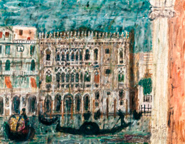
The portrait format from 1949 and the landscape format from 1950 present that architectural masterpiece of the Venetian Late Gothic, with adjoining set pieces of the Loggia de Pescheria on the opposing bank. In the earlier painting, the foreground motif is heavy and burdensome. The view of the Ca’ d’Oro, given no particular weight, remains in the background. The architectural lines exhibit edginess and sharpness, whereas the colors are pallid and flat, and the brushstroke dry and thin, such that the canvas’ color base remains brownly present. In the second version, by contrast, the polychrome marble façade of the palace with the three loggias atop one another, and the intricate tracery and crenellations inspired the painter to a sublime use of color. The colors assume the glow of mother of pearl. The shades of blue of the water and sky now become a glittering frame for the magnificent building, like a gemstone in a setting. The characteristic style of the streak-shaped and dot-shaped brushstrokes nonetheless continues to stand out, with a certain flickering, whirring, and coruscating about the scene, and the contours becoming increasingly hazy. The gondolas are black-contrasted silhouettes against the radiant color of the ground. The topographic scene’s illuminating light ( Beleuchtungslicht ) is converted into colored light ( Farblicht ), See Wolfgang Schöne, Über das Licht in der Malerei (Berlin, 1954), p. 210. insofar as, to adopt the terminology of Wolfgang Schöne, the colors themselves emanate celebratory light with no external light source. Peiffer Watenphul described his artistic intentions in a July 1949 letter: “But I now would like something different in my paintings than what I wanted before, when I was more easily satisfied and happy just to achieve a few piquant allurements of color and something coquettish. And now I would like to go much deeper and construct a comprehensive spiritual world.” Letter to Richard Parrisius dated July 7, 1949, quoted in Werkverzeichnis(see note 6), p. 36.
This spiritualization of the motif in sfumato and in colored light was already fulfilled in such 1950 paintings as the landscape-format Ca’ d’Oro .
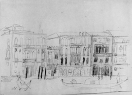
Peiffer Watenphul’s understanding of his mode of operation is helpful in evaluating his intentions. Although the artist prepared sketches of topographical situations to realize in subsequent paintings, he often, perhaps even predominantly, created paintings on the basis of other materials. These were culled from old and new photographs by others, tour books like that of the Touring Club Italiano, and postcard illustrations, This material is in the artist’s papers. astonishing in view of the painter’s judgment against photographic clichés. He wrote in “A New Venice” in 1952, “Everything is photographed and illustrated on postcards with such unbelievable frequency that one really dreads seeing again and again the usual vedute of San Giorgio, of the Piazza, or the Rialto. I exerted myself a whole, long year, and repeatedly destroyed each evening, what I had painted in any given day because I just could not seem to succeed in seeing anew, and providing a personal tint to my depiction of all these so unbelievably frequently illustrated things.” See Max Peiffer Watenphul, “Ein neues Venedig,” (see note 7). The artist nonetheless realized that overcoming postcard views is possible precisely by using and changing them, since what was meant artistically was not the subject matter, but the transformative power of painting.
private collection
private collection
The painter takes what is clearly and exactly captured in the photograph in an only too frequently repetitive fashion, extracts it from the light of day, and inserts it into the vibrating light of painting. This power of painting to cause change is again apparent in the two paintings Palazzo Dario from 1950 and Ca’ di Desdemona from 1951.
Out of the architectural motif, as captured in the tour guide and the historical photograph assuredly employed, fields of painting arise through the arbitrary framings and the accompanying dissolution of the spatial context. The early Renaissance façade of the Palazzo Dario, with its asymmetrical arrangement, is cut off immediately after the rosette-shaped porphyry roundels. A part of the adjoining Palazzo Barbaro-Volkoff is brought into the image on the other side. The dark shaft between the palazzi mysteriously presses its way almost into the center, much like how the entire painting is surrounded by darkness. The individual motifs radiate in proportion to their respective degrees of colored light. The narrow version of the Ca’ di Desdemona , the Palazzo Contarini-Fasan that is popularly believed to have been the house of Desdemona in Shakespeare’s “Othello,” is emphasized within the painting by its violet color tone, an echo of the color tones of the water and sky. The neighboring palazzi are once again arbitrarily cut off, just like the black bodies of the gondolas in the foreground. The poetry of color has taken possession of the motif.
1955 Kunsthalle Kiel
1957 private collection
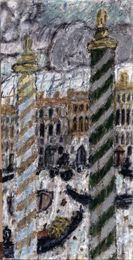
The two nearly identical portrait-format paintings entitled Canal Grande from 1955 and 1957 work even more strongly with limited, minimizing color contrasts. Each painting is attuned to a certain color tone that creates an overriding monochrome tendency across every zone of the image. The painting from 1955 cannot be topographically localized. A turquoise blue color tone takes a unifying hold on every object in the image, including the two docking posts that dominate in the foreground, with their dialogic marking rings as well as the water, clouds, and architecture. Even the silhouettes of the gondolas are interlaced with turquoise blue. The execution of the brushwork, set down stroke by stroke, remains clearly legible and appears to increasingly disassociate itself from representational forms. The flickering light of the scene dissolves the contours. In the portrait-format painting from 1957, it is still possible to identify the location. The buildings are the Ca’ da Mosto, with its two Veneto-Byzantine lower levels from the twelfth century, the Casa Dolfin, and parts of the Palazzo Bollani-Erizzo, in which Aretino is said to have lived. Yet, these historical differentiations are insignificant since the painter likens the architecture of all of the palazzi to one another by compressing and extending the arcades and windows; a brown-violet color tone flows like water over the entire painting, and the details are intentionally obscured. A preparatory pencil sketch from 1956 is extant for this painting, See Werkverzeichnis(see note 6), Z 480. substantially more precise in the details of the architecture and in the concise noting of the colors of the façades.
Von der Heydt-Museum Wuppertal
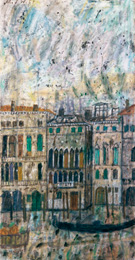
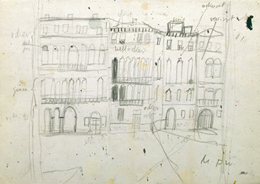
There has also come down to us a similar drawing from 1956 for the two 1956 landscape-format paintings, Venice, Canal Grande at Night and Venice, Palazzi on the Canal Grande, Ibid., Z 479. with the night-time painting more narrowly excerpted on the righthand side.
private collection
private collection
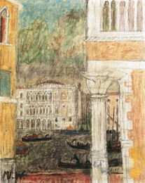
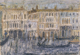
The daytime painting, by contrast, reproduces all of the fronts of the houses in the same way that they are captured in the drawing: the Palazzo Corner-Contarini, the Palazzo Tron, the Palazzo Barzizza, and the Palazzo Busenelli-Giustinian. We are familiar with this topographical situation from the aforementioned painting Venice from 1950. The night-time painting uses white heightening to make all of the arcades, balcony balustrades, decorative crenellations, and other architectural decorations seem like painterly lace contrasted against a darker background, whereas the daytime painting is overcast by a painterly fog, with the entire painting sinking into tones of gray and olive.
private collection
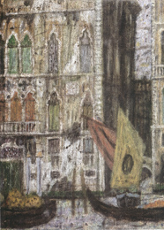
The chronologically latest two Venice paintings in the exhibition, Venetian Palazzi and Venice, Palazzo and Sailboat , both from 1957, do not permit localizations. In Venice, Palazzo and Sailboat , the coarse canvas structure used earlier by Peiffer Watenphul’s first spiritual instructor Paul Klee makes a unifying appearance. The thinly applied color tones endow the pictorial objects with only a ghostly presence. The painting of the Venetian palazzi, cutting off hard the architecture of the upper floors, is also blurred, as though a reflection in water. The tinges of blue identify the painting as depicting the earliest beginnings of dusk, with colors that are still fading. Peiffer Watenphul’s paintings of Venice, with their color experiments that increasingly conceal the scene and that delve into pure painting, are both self-contained and independent within the context of figurative art of the nineteen-fifties. They have little in common with the city portraits of Oskar Kokoschka, for example, which expressively accentuate topographic features. Peiffer Watenphul’s paintings are figuratively arrested, on the one hand, in the representational, but, on the other hand, display abstracting tendencies in their execution and in the pictorial problems posed. The paintings take on their particular position in twentieth-century art when discussed as precursors to the photo paintings of Gerhard Richter, likewise consciously cultivating the “phenomenon of blur”: “In Richter’s photo paintings, the heightened flickering ensures that the medium remains present and cannot be ignored in the reception … The technical defect of blur functions in painting in a manner similar to noise in the transmission of a message … Things that appear in the fog of blur have not been fixed and remain in a problematic, intermediate stage of appearance and disappearance.” See Oskar Bätschmann, “Gemalte Irritationen. Gerhard Richters Prinzip der Unschärfe,” in: Neue Zürcher Zeitung,international edition no. 265 (November 14/15, 1998), p. 49. Peiffer Watenphul’s paintings of Venice also capture these intermediate stages. Colored light and colored veils lift the pictorial details up out of the grounding or smooth out pictorial contrasts. Like Richter, Peiffer Watenphul has a sort of “atlas” on which he draws for his painted experiments, postcards, photographs by other photographers, and drawings as notes of his own. These models provide external data, which painting then conveys into the colored floating state of “appearance and disappearance,” and of materiality and spirituality that distinguishes these works.
In: Max Peiffer Watenphul. Von Weimar nach Italien. Walter Steiner and Mario-Andreas von Lüttichau, eds. Published on the occasion of the eponymous exhibition at the Bertuchhaus and the Kunstkabinett am Goetheplatz, Weimar 1999 (Cologne, 1999).
© Dr. Stephan von Wiese.
Reprinted and translated by kind permission of the author.