Michael Semff
Max Peiffer Watenphul: Drawings of the South
Max Peiffer Watenphul’s fame is based on his culture of color and on the almost classical symmetry that imparts to his subtly constructed landscape compositions their specific sound. Like faintly shimmering intarsias embedded in the pictorial ground, the dominant color fields in the paintings and watercolors elude every glowing outwardness: the dark, bellied umbrellas of the ubiquitous pines, the cypresses’ slender shapes standing out over the ground like upside-down exclamation marks, the fields in various shades of sea-blue and sky-blue, the bright façades of the houses in Morocco. Nearly all of Peiffer Watenphul’s paintings seem as though there were an invisible membrane between them and the observer, an atmospheric veil, making the paints indirect, as though transported through a sort of a sfumato into the aura of distance and timelessness. These paintings are primarily variations, in extensive series, on the theme of the still life and the theme of the southern landscape. The strictness of their inner framework, the restrained rhythm of their formal elements, and the noblesse of their colors were things the painter worked out across decades of hard work questing in search of how to endow his preferred subjects with their essential expression. Similarly, the representational inventory recurs throughout his works. The reduction to a small number of succinct subjects, their harmonization in, at times, unusually narrow formats, and the coloristic sensitivity equaled by few if any other German painters of his generation result in works that are highly recognizable through their unmistakable personal style. Peiffer Watenphul succeeded in wresting a valid image from the Mediterranean landscape, a highly artful stylization which led to an aesthetic of the “higher simplicity.”
Keeping in mind this painter and master of the watercolor, it is worthwhile to take a look as well at him as the nearly unknown draftsman. Peiffer Watenphul certainly accorded independent status to his drawings. He generally signed or initialed them, and not infrequently, minutely dated them, causing the name or initials, as with Giorgio Morandi’s drawings, to often appear outsized in the picture. Nonetheless, he generally kept his drawings out of the public eye during his lifetime. In exhibitions and publications, they predominantly appeared as marginal splinters alongside the spectrum of his painterly oeuvre. This neglect was lessened by the appearance of volume 2 of the catalogue raisonné, which incorporated over 1200 drawings (including sketchbook pages), roughly comparable to the number of surviving watercolors by the artist. Max Peiffer Watenphul. Werkverzeichnis,vol. 2, Grace Watenphul Pasqualucci and Alessandra Pasqualucci, eds. (Cologne, 1993).
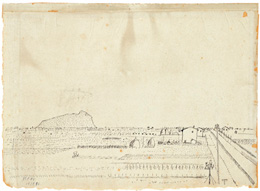
Peiffer Watenphul’s drawings, which this exhibition places at center stage for the first time, lend themselves, at times, to a nearly experimental approach to the materials used, an approach highly comparable to the approach taken in the paintings. The thin, often stiff and abrasive strokes reveal a heedlessness with which the drawer surrenders to nature in a more unfiltered fashion than does the painter. The artist used pencil, pen, wooden sticks, chalk, colored pencils, red chalk, and from the nineteen-fifties on, ballpoint pen on paper; the paper’s various textures and colorings also contribute to determining the effect of each sheet and its graphical appeal. He lets the medium speak, taking into account the naked materiality of handmade paper, with its irregularly frayed edges and its “color temperature” ranging broadly between warm and cold tones as a vehicle for his individual aesthetic, much like how he uses the coarsely porous canvas, in many instances untreated, that shows through in his paintings. The artist’s drawings are predominantly unbound, but reflect time and again on the work process, or the compositional preparation that leads directly to a painting. Of the works included in this publication [M. Semff, “Max Peiffer Watenphul, Zeichnungen des Südens,” exh. cat. Munich 2007], a total of fourteen drawings can be identified as preparatory studies for paintings and watercolors. In particular, the pencil drawings made in Venice, beginning in 1947, are largely studies for paintings, as attested to by the frequent indications of colors to use. With regard to the relationship between drawing and painting in the work of this artist, it is striking that a large number of watercolors exist for the still life, one of his preferred themes, but hardly any preparatory drawings. By contrast, there is a significant group of drawings of mountain landscapes, yet, this theme did not prompt any particular attention in the paintings. In this regard, see the essay by Susanne Wagini in this catalogue, pp. 17ff. [Ibid.]. A 1920 drawn landscape Landscape near Anif (Z 14) displays, for the first time, the motif of cragged mountains together with houses, a motif that reappears in works from the late nineteen-forties.
The visual impression was always the inspiring driving force for Peiffer Watenphul’s creativity. On the countless journeys he undertook from the nineteen-twenties on across Europe, Africa, and Mexico, he tirelessly sought out landscapes and urban architectures that could motivate him artistically. He reacts with the finest sensorium to the various localities and characters of landscape, and is not seldom disappointed in his lofty ambitions, his hopes and visions. His image of archaic Italy was deeply internalized and formed early in its intellectual conception. He needed only to exert himself anew to reconstruct this image, as it were, in front of given subject matter. For the painter, encountering the landscape meant affirming anew for himself the elementary building blocks of nature, so as to advance forth from this fundament to the strictly organized choreography of nature in the image. He was after nothing other than the abstraction of the sum of these building blocks to attain an emblematic integration and concentration of the pictorial structure.
private collection
His journey to Italy in 1936 and his move there in the following year mark the beginning of that impressive series of drawings, with landscapes from Sicily and Ischia, that have a sound all their own in his oeuvre alongside the paintings and watercolors. The Landscape near Latina (Z 53) is singular among the extant drawings, with an unusual linear arrangement that calls to mind the careful sharpness of an architectural sketch, unlike other drawings of the artist. From a distance, one may also recall the glassy transparency of certain drawings made by Jacob Philipp Hackert in the same region a century and a half earlier. Among the motifs of Sicily, Peiffer Watenphul was particularly fascinated by Cefalù, that site on the island’s northern coast, with its majestic mountain backdrop and the famed Norman cathedral. The Cefalù and Ischia leaves, up through 1940, are generally drawn in pen and India ink, in powerful contours on handmade paper dyed various colors, and the artist denies himself everything that could even come close to conventional beauty: all elegance of outline, every cantilena of a “handwriting.” Instead, he insists almost mulishly on a dryness of workmanship and seeks to create ceaseless “oppositions” in his drawn structure. All of the building blocks of a given subject are taken seriously and captured to a certain extent “literally.” The dominant aesthetic names the things presented, but never conceals or glosses over them. The struggle with the arrangement of the various schematic levels of the drawings, the latent connecting of near and far, of detail and whole, the peculiar shifts in proportion of the sections of the pictures, in the valence of surface and space, and in the ever-alternating interplay between positive and negative parts all lead to an untamed, excited, at times, dramatic tension in these drawings. The pen scratches out the contours of tree trunks and roughly encircles the shapes of mountain and cliff formations and houses with the same linear valence accorded to the shapes of clouds or sails. Empty outline drawing dominates without any indication of zones of shadow. The drawer uses broad-meshed crosshatching only to accentuate certain formal fields and to achieve their tonal integration into the scheme of surfaces. Peiffer Watenphul renders the picturesque “postcard” beauty of his subject matter, The artist made extensive use of postcards as models, and to check his work, as attested to by extant postcards showing sites in Venice. for example, the famous Spiaggia degli Inglesi on Ischia, with a hardness, barrenness, and sobriety that can almost be called Teutonic. The luxuriantly proliferating vegetation of palms and agaves is outlined page by page, as in the jungle paintings of the revered Henri Rousseau, and the vegetation, like the tops of the trees and the peaks of the pines, is objectified without smoothness of any kind. Peiffer Watenphul does not seek out transitions or summary connections in the rhythm of the landscape-like. Instead, trees and groups of bushes are cut off by the edge of an image, superimposed atop one another, and concentrated into weightings that are, sometimes, almost disharmonious. Not a hand’s breadth of these drawings seems harmonized or stylized, in composition, color, or otherwise, in the way the paintings are. Likewise, there is absolutely no tendency toward a lyricism of the sort practiced, for example, by Peiffer Watenphul’s artist friend Werner Gilles in his drawings, from Ischia, of beaches and fishermen. Peiffer Watenphul’s art always avoids enchanting landscapes, scenery, figures, and the conveyance of something as “legendary” or “mythical.” Werner Haftmann, Malerei im 20. Jahrhundert,fourth ed. (Munich, 1965), p. 462. A particular appeal of the artist’s drawings of the South is based on the fact that, in their “indivisible combination of subjective expression and material character,” Margret Stuffmann, “Gedanken zum Umgang mit Zeichnung unserer Zeit” (on the occasion of the presentation of “Zehn Meisterzeichnungen — Neuzugänge der Graphischen Sammlung” on November 27, 1996 at the Neue Pinakothek in Munich), (Munich, 1997), p. 6. they pay no homage to a canonical classicism of the sort highly cultivated by Peiffer Watenphul as a painter. At the same time, the drawings conjure nearly in whole that style of the “disharmonic-harmonic” of which Gustav René Hocke wrote so penetratingly. Gustav René Hocke, Max Peiffer Watenphul. Persönlichkeit, Leben, Werk(Stuttgart, 1976), p. 20.
Drawings dating from the nineteen-thirties already show the nearly imperceptible integration of pictorial motifs into a surface context achieved through uniform linear enlivening of empty surfaces (sky, sea). The dashes, scribbling, dots, and spots of India ink, repeated seemingly without intention and spread across the surface sometimes resembling mold, have the effect of night-wandering, “traces of the movement of the hand.” Bernd Krimmel, “Innenbilder,” in exh. cat. Max Peiffer Watenphul. Gemälde—Aquarelle—Zeichnungen, ed. Bernd Krimmel, Kunsthalle Darmstadt (Darmstadt, 1972), p. 22. Peiffer Watenphul’s artistic ways take form here, found neither in the paintings nor in the watercolors of these years, but which would characterize the artist’s work across all his visual genres from roughly 1950 onward. A similar phenomenon can be noted in the work of Zoran Mušič, with whom Peiffer Watenphul enjoyed friendly relations beginning with his extended stay in Venice. Nevertheless, it is impossible to overlook Mušič’s more pronounced ornamental inclination in the graphisms that enliven the pictorial grounds in Mušič’s gouaches and paintings from the late nineteen-forties on. They immediately call to mind Byzantine influences, evoking the glitter of precious materials at times. What could, at first glance, be interpreted in Peiffer Watenphul as a means for the suggestion of atmosphere in the naturalistic sense is already revealed in the drawings of the nineteen-thirties as an artistic method to hide the subject as though behind a veil that filters light, and shapes the graphic character of every depiction, echoing, in the process, the sound of melancholy and contemplation. Peiffer Watenphul’s unmistakable individuality is shown in how this sound is produced (in the paintings as well) not only through color, but also through its interplay with elements of draftsmanship. Perhaps it was no coincidence that one of the decisive experiences in the life of the artist as a young man was his discovery of the “scribblings” of Paul Klee, on which he commented in 1949: “As a very young university student in the year 1915, I went to an exhibition at the art dealer Goltz and was struck by drawings that were like none I had ever seen. They most closely resembled childlike scribbling and patterns of the sort often seen on layersons’ walls and depictions of martyrs. The small drawings fascinated me so much that I went almost daily to the Goltz gallery and stood before them, enthralled. This was my first encounter with the work of Paul Klee.” Max Peiffer Watenphul, “Erinnerungen an Paul Klee (Venice 1949),” in Werkverzeichnis,vol. 2 (1993), pp. 36–40. During his time at the Bauhaus beginning in 1921, Peiffer Watenphul was a frequent visitor of Klee’s. Later, he reminisced about these encounters with Klee, emphasizing the “wealth of his formative powers” as well as Klee’s fondness for the “strangest material inspirations,” and describing Klee’s experimental spirit of drawing and scribbling, scratching around and using a putty knife in the virtuosic appropriation and transformation of the most heterogeneous materials. Ibid., p. 38. It seems obligatory, thus, to view the permanent presence of linear traces in both the drawn and the painted oeuvre of Peiffer Watenphul against this background of his early experience of Klee. On January 18, 1950, writing from Venice, he described to Maria Cyrenius a week that he had spent in Cortina: “I am painting a great deal and have recently also been drawing with great gusto. My nieces say that the drawings are scribbling, and that is what they are supposed to be. But simply on an entirely different level!” Werkverzeichnis,vol. 1 (1989), p. 55. This “entirely different level” can be understood in the impressive series of mountain drawings In this catalogue, see the essay by Susanne Wagini, pp. 17ff. [M. Semff, Max Peiffer Watenphul, Zeichnungen,exh. cat. Munich 2007]. as well as in his pictures of Venice, some vigorous, some gentle, in which gestural graphisms run across the sheets of paper and the canvases and, together with the color of the relevant medium, endow them with expression and often set them into gloomy and dramatic vibration. Occasionally, analogies proposed in the literature regarding the artistic methods of tachismeand of “arte povera” may seem convincing in their connection to the time. (On this see Hans-Werner Schmidt, in exh. cat. Max Peiffer Watenphul. Italienbilder,ed. Hans-Werner Schmidt, Kunsthalle zu Kiel (1993) and Städtische Sammlungen, Schweinfurt (1994), Kiel (1993), pp. 8–9). Thus, particular graphisms of Peiffer Watenphul exhibit external resemblances to the emptying that results from the quasi-unintentional movement of the hand in Cy Twombly’s drawings from the nineteen-fifties on. In Peiffer Watenphul’s case, however, this has been done for an artistic purpose. In the context of subject, space, surface, and color, these are hardly intention-free “scribbling.”
It is not easy to situate in art-historical context the drawings of this man who was markedly a loner. We have already mentioned Gilles’s so different temperament, his specifically poetic and metamorphotic approach. Likewise, the powerfully, expressively composed “lyrical image poetry with symbols of reality” Werner Haftmann, Verfemte Kunst: Bildende Künstler der inneren und äußeren Emigration in der Zeit des Nationalsozialismus(Cologne, 1986), p. 461. of a Werner Heldt and the reed pen drawings made by Eduard Bargheer on Ischia, with the gentleness of their strokes and their construction up out of small parts, are always able to approximate non-representational structures, omit the drastic, distinctive, and never aestheticizing directness in the realization of nature that Peiffer Watenphul visualized in his drawings. The closest parallels are most likely those with the art of the significantly older Hans Purrmann, in particular, in the interweaving of French traditions. Revealing in this regard is Peiffer Watenphul’s account of his journey to London in a letter from April 1936. In it, he first expresses his admiration for William Turner, then adds: “Also magnificent Bonnards—my latest great weakness. Far more sensitive than Matisse.” Letter to Maria Cyrenius, Salzburg, printed in Werkverzeichnis,vol. 2 (1993), pp. 28–29. Even if the latter assessment was likely not meant in Purrmann’s sense, it seems probable that Peiffer Watenphul already knew and esteemed the work of Pierre Bonnard as both painter and draftsman. It is, nonetheless, difficult to make a direct comparison between the mentalities of the two artists in their drawings, See Krimmel (see note 8), p. 22. or even to state that Bonnard’s graphic art served as a model for Peiffer Watenphul. This is because Bonnard’s chalky lines, not dissimilar from those of Edouard Vuillard, seem far softer in timbre than Peiffer Watenphul’s accentuation of line, which are more pointed and sharper in every detail.
After the end of the war, Peiffer Watenphul richly developed his oeuvre of drawings based on Southern motifs, creating numerous individual leaves and hundreds of sketchbook drawings. These were made, in particular, in Venice, Rome, and Morocco, and time and again, on Ischia, in Greece for the first time in 1961 and often thereafter; later, especially in Corfu from 1964 on. One year earlier, the artist’s brother-in-law acquired the country estate Il Pero in southern Tuscany, where the painter went “always only for a short time”: “… the landscape was too wild and austere for him. He preferred Corfu and southern Italy …” Grace Watenphul Pasqualucci, “Erinnerungen an meinen Bruder, Max Peiffer Watenphul,” in exh. cat. Wuppertal 1991, pp. 29–30.
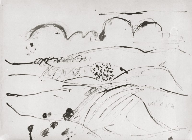
In the early nineteen-seventies, no longer able to paint because of health reasons, the artist worked in exactly this landscape, the “Crete di Siena.” It did not suit his disposition precisely, though in the period before 1950, it had, along with Venice, provided fertile soil for the art of Mušič. It was there that Peiffer Watenphul created his last works. In two Landscapes at Pero (Z 656, 657) in pen and brown India ink, he embarked on unusually bold phrasings. There is no greater opposition to this than the cool discipline on display in the drawing of thirty-seven years prior, Landscape near Latina . Nor could the chasm be any deeper between the all but wild furor of the old Peiffer Watenphul and the fragile ascetic spirit of the young Mušič.
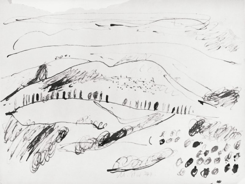
In the aggressive characteristic style of Peiffer Watenphul’s pen, perhaps the quietest landscape in Italy discovers an unexpectedly dramatic resonance. A few basic forms are repeated. With expansively swinging contour lines and dot-like concentrations of nested strokes, the visible elements of the landscape—hills and clouds, olive trees and cypresses—are notated in figurative abbreviations, like in a musical score, and forced into a swift, dynamically scanning rhythm. It would seem that the barren spirit of “Crete” has been formally exploded in the eyes of the draftsman. He was able to evoke that spirit with nearly baroque, utterly uncanonical means. These leaves are the last testaments of a master who, also as a draftsman, succeeded in subjecting himself to direct experience, in its rendering, to the end, to find an expression in which abstraction and the fullness of nature reciprocally heighten one another.
In: Max Peiffer Watenphul. Zeichnungen.Exh. cat. Staatliche Graphische Sammlung München, Munich. Michael Semff and Susanne Wagini, eds. (Munich, 2007). © Dr. Michael Semff.
Reprinted by kind permission of the author.